
If you have worked, for any period of time, in a customer-facing role, it is easy to believe that members of the general public do not read signs.
People read outdoor signage perfectly well, and may be able to locate your premises easily, but once they step inside they seem to all but stop paying attention: ‘please wait here’ signs are brushed past, instructional diagrams ignored, and wayfinding signs seemingly avoided in favour of asking staff for directions. There are a few reasons for this and there are steps to help avoid it, which we will look into in further detail in this article.
Please note: these tips are for those signs found inside of a business’s premises rather than the large fascia signs that hang outside or on the exterior walls of a building.

Why do people ignore indoor signs?
We have spoken before about how important indoor signage can be to a business, especially when you take into account the legal requirements for some of the information displayed, as well as the benefits they offer in making the customer experience as smooth and enjoyable as possible. And yet there are some customers who still seem to struggle to absorb signage information, and some signs that don’t seem to get read – time and again.
Considering how much signage and advertising the average person is exposed to on a daily basis (the figure is debated at being anywhere between 6,000 to 10,000 a day) it is hardly surprising that a few slip past us unnoticed. But why are there some signs that customers seem to simply refuse to acknowledge? The first step to combating customers not reading signs is to understand why it happens in the first place.
As well as being annoying to employees, it can also pose real risks if a sign is being ignored which contains information vital for health and safety. The problem is especially pertinent now, as we all seem to be suffering from over-saturation of information, and signage telling us what to do, something called ‘sign blindness’ following from the excess of informational signs that guided us through the Covid pandemic.
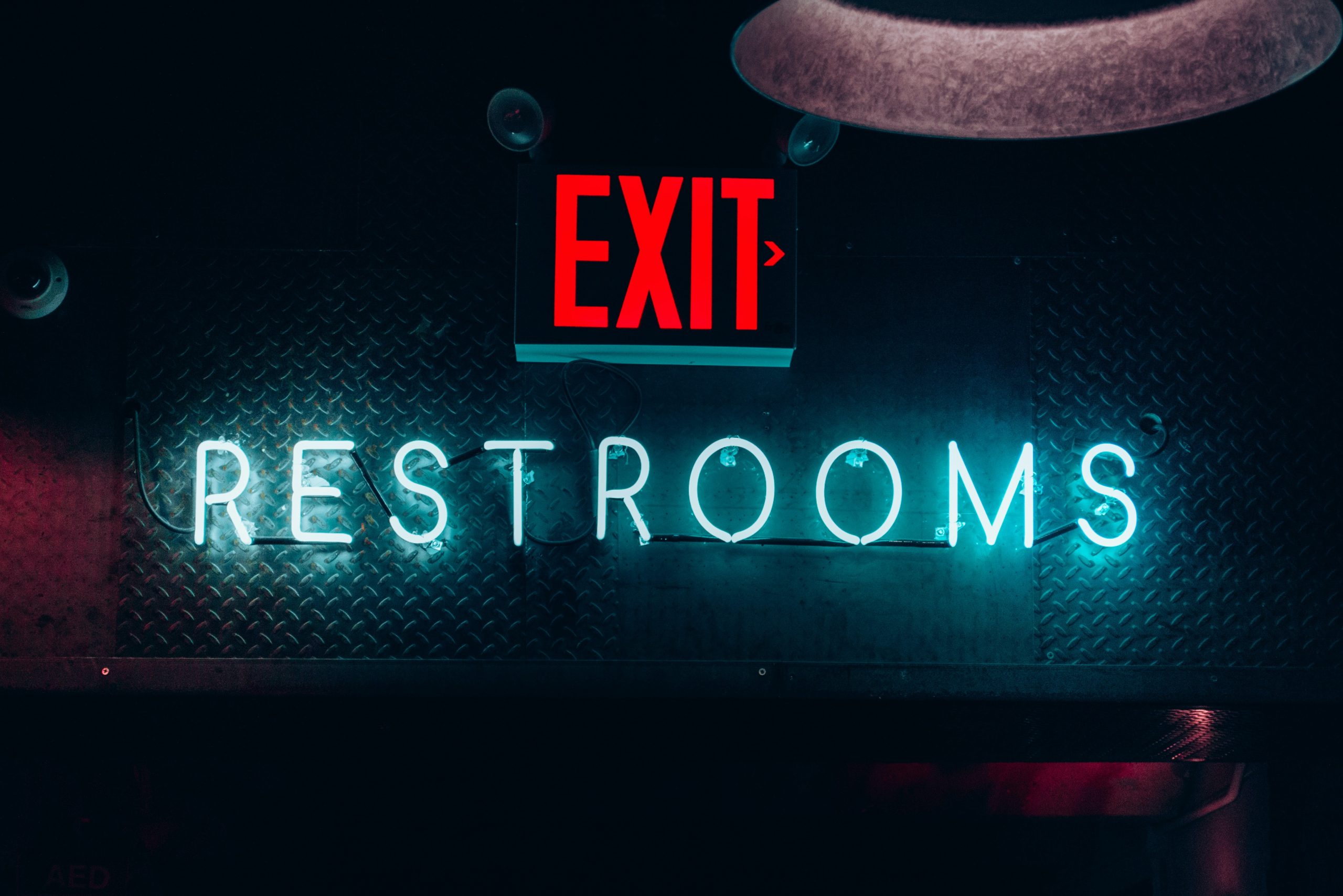
This has led to us becoming desensitised to the impact these warning signs have, or seeing them so often that we assume we already know what they are going to say.
Then there’s the case of us unintentionally and genuinely missing what is right in front of our faces. This is known as a phenomenon called in-attentional blindness, and follows a study which had members of the public take part in the ‘invisible gorilla test.’
If you haven’t seen it, it shows a group of actors passing a ball back and forth and viewers were asked to count the number of times the ball was passed. At one point someone in a gorilla suit walks through the actors, thumps its chest, and then walks off-screen. The majority of those watching failed to notice the gorilla as they were so intent on counting the passes.
There are multiple reasons why this may happen in an everyday scenario (such as the public not reading your ‘pay here’ sign) which can vary from simply being distracted by their thoughts or something else in the store, to them not expecting to see something so are not actively looking for it, even when it is right in front of them, such as was the case with the gorilla.
This can be exacerbated by the issues described above with regards to sign blindness, and other factors such as the customer being in a hurry or the sign containing information contradictory to what they deem to be obvious.
Interestingly it seems that different people have different levels of this blindness, with higher or lower ‘working memory capacity’, which will then be influenced further by if they have other things on their mind or how regularly they frequent the premises.
The way to combat this is to get strategic about signage. Make sure customers are not overwhelmed by multiple signs in one place, and all signage is carefully planned, designed, and placed to maximise clarity.
It can help to make a note of which signs are ignored the most, and try to see from the other side of the desk why that may be. We’ve also included a few tips on giving your signs the best possible chance of being noticed, customer’s attention span notwithstanding.
 |
|

Tips on making your sign visible & readable
While there will always be people who simply choose to ignore signs, there are active steps that can be taken to give the sign you need reading the best possible chance at catching their attention:
- Opt for matte coatings over highly glossed ones, as these can reflect light, distorting the message and imagery of the sign.
- Consider lighting. If it is an important enough sign, either place it near a light source or even better, a sign that is backlit, meaning that it will be visible at all times, day and night.
- As obvious as it sounds, consider the placement of the sign. What may be obvious to you may not be a highly visible place to a customer. In these instances it helps to enter and walk around your premises as a customer would, to see where their eye line naturally falls or if there is anything that may be considered confusing.
- Make the information on the sign as accessible as possible by ensuring it does not use overly technical language or wordy sentences. Make use of well-known symbols or imagery wherever possible, such as the recycling symbol to label a bin rather than the word. This is especially important for providing clarity for customers who don’t speak English!
- Don’t overwhelm with multiple signs: when confronted with numerous things to grab our attention, we tend to end up not looking at any of them. Place the signs that are most important directly in line with where the customer naturally looks, such as above the server in a cafe setting or next to where they are queuing – a waiting line can be the perfect place for promotional signs as people tend to look around more, wanting something to distract them from the wait – rather than where suits you.
- Do the drive-by test: can the sign be roughly understood when glanced at for the briefest moment? With the exception of legal or safety signs that need to be succinct, or menu lists that the customer will already be actively looking for, all signs should follow this test if it is to succeed at being noticed.
- Use colour and contrast deliberately: contrast is always important in ensuring lettering can be read at a distance, and colour can be used to denote meaning (such as red and yellow for warning signs). Don’t confuse people with your own take on colour coordination, stick to what they know and expect!

Final thoughts
Indoor signage is a must for promoting and safely running your business, so it can be frustrating to have it ignored, even when placed in what you would have thought was an obvious place.
Yet with a bit of forethought and design changes, there’s no reason to put up with signs that pass the customers’ notice entirely. Here at Medash we relish a challenge and love nothing more than using our decades of experience to create signage for you that can’t help but grab the customer’s eye. Contact us today to get started.