
Your store front lets anyone passing know exactly what you do and who you are. Here’s our guide to shop front signage for 2024 and beyond.
Your shop front signage is the first thing that any potential customer is going to judge your business on, as it is generally the first thing that they see that represents you. You may not think that this is all that important, after all, it is for your product or services that most customers will seek you out, but there’s a well known statistic that approximately 85% of a store’s regular customers live within a five-mile radius of the shop. That means that most of your future clients may already be walking right on past. So what ideas are there for shop front signage? Let’s take a look.
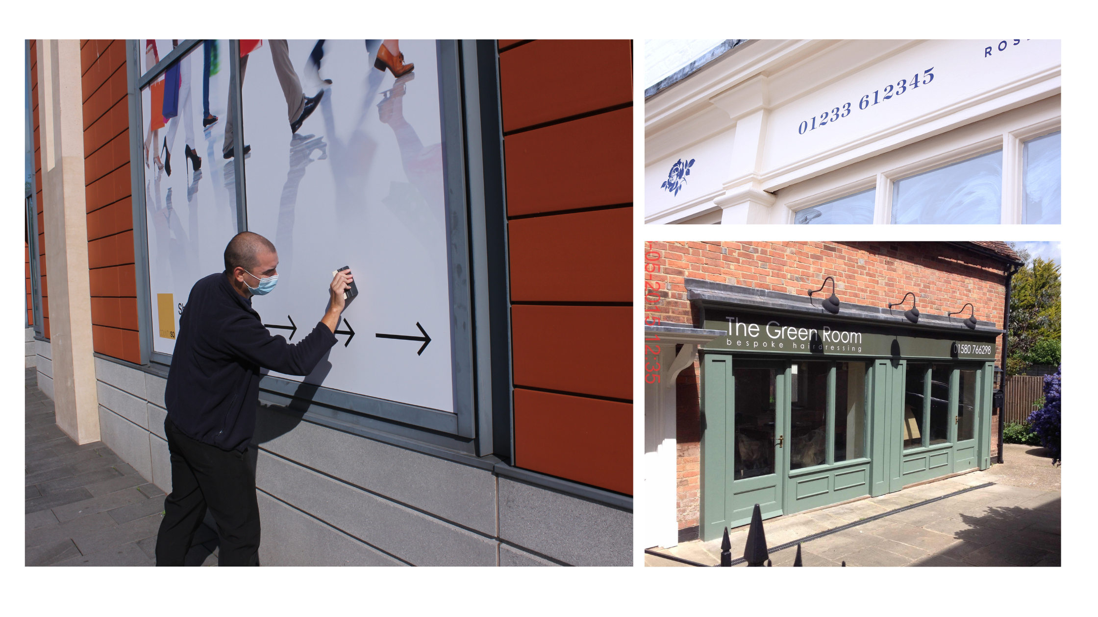
Contemporary shop front signage ideas
We put our heads together and came up with this collection of shop front signage ideas for anyone starting a new store or looking to update and upgrade their current signage to make use of the latest designs and technology currently available.
Neon signage is back
Walk along any up-and-coming high street and you’ll see just how popular neon signs have become. There are now options for faux neon too, using energy efficient LED lights, although you won’t get the icon glow and buzz associated with these icon signs. These kinds of signs work best if extra information isn’t needed on the sign. For example, if the business has a strong website and social media presence, contact info isn’t really necessary, so a simple neon sign with the company name, logo or slogan will suffice.
Natural materials
There’s been a real resurgence in the use of natural materials (or substrates that replicate natural materials) in recent years, either because of a particular aesthetic choice or because the brand in question wants to convey a home-made, all-natural character.
In a similar vein, rustic – or literally rusted – metal signs have grown in popularity, especially when combined with wooden detailing. Steak houses and back-to-basics (but high quality) eateries have leaned heavily into this look, with the wood and metal theme being replicated around the rest of the store in supplementary signage, lighting choice, and, in some instances, even the very tables and chairs that the customers sit on.
Cut out letters
3D lettering and doing away with the backing of a traditional sign is now a regular feature of shop front signage designs. Cut out lettering takes this one step further – both with the letters being cut out or with the letters being made up of the blank space cut out of the sign itself. This looks particularly great when the sign is made of metal.
For cut-out letter signs there’s also the option of building them up to create 3D letters, which can then have contrasting colours down the side to create a cool visual effect. We’ve seen great examples of this, where from the front the sign is made up of minimal colours, such as white and black, but when seen from even the slightest angle, a shock of neon can be seen down the side of each letter. Add in some lighting and you’ll get a fantastic shadow show after dark too.
Classic shop front signage ideas
Not every company is going to want to go with the latest trend, in fact, some would probably look a bit silly doing so. For luxury brands or those who are stalwarts of our high streets (banks, opticians, funeral directors et al) there will be a need for more of a classic design focus, with elegant finish options and something that convey durability and timelessness. You could even add an established date to show longevity and standing within your community and sector.
Backlit/lightbox
Lit-up signs are classic. Whether you go for a design with obvious light sources, such as the marquee designs of decades past, or subtly lit light boxes, the addition of lighting your sign has so much more benefits than simply being visible when it is dark.
Minimal signage – name only signage
With most businesses now also having an online presence, the need to convey every piece of information on a sign is no longer necessary, so we are seeing a return of the minimal, but eye-catching, single-word sign that merely states the brand’s name. When designed beautifully, with careful attention to the font choice (with no other information it is vital that the writing is readable!) and by opting for including lighting, you can seriously create a sign that will turn heads and become a piece of art in its own right.
Using humour to attract attention
While a funny sign will not suit every type of business, there is a lot to be said for a sign that brings a smile to the face of anyone passing by. Plus, humour has a great way of sticking in your memory, meaning that, even if they don’t go in when they first pass by, a potential customer will remember your sign and may come back at a later date.
Shop front signage ideas for awkward properties
Not all retail and business spaces are created equally when it comes to layout or opportunity to display your signage and brand.
Glass fronted stores
More and more retail units (especially when found within a mall setting) come with an all-glass front nowadays, and while it may look modern and sleek, it can be somewhat of a challenge for signage options. There are two main avenues you can take to combat this: get creative with where you can place your sign, or have a different type of signage altogether.
The most popular solutions are:
- Window graphics
If you’ve got a massive window, you may as well use it. Window graphics can be a great way to label your premises, while still allowing customers to look inside the store. Kiss cut vinyl wording can be particularly effective.
- A lit-up sign hangs behind the window
If your business really does need a full on, built up sign, you could always hang it from the ceiling just behind the glass, or on a back wall, if it is visible from outside the premises. Neon signs have grown in popularity in this format, for example.
Protruding/projecting signs
If your shop front is small, or in some cases, just a door and there is truly no space for any significant over-the-door sign, you could always opt for a projecting sign. As well as standing out from the crowd, it also has the added bonus of being visible from further down the street – something that most fascia signs can not proclaim.

Tips for designing your shop front signage
When it comes to designing your retail signage, it can be tempting to go for the prettiest, most popular font you can find. While this may work for some, you need to think about what a storefront sign is primarily for to be easily and quickly read and to convey your business name &/or give a clue about what it is that you do. The best trick to see if your signage text is easily readable, try squinting at it from a distance or reading it while walking past.
A note on popular fonts: they date quickly. We only have to think of the Papyrus font that haunted films of the early 2000s (and has been cited as the world 2nd most hated font) and the faux calligraphy that started out as a neat way to convey a grassroots, approachable feel to a small business, but is now used to sell hot cross buns in Tesco. Luckily, we’ve got a blog post on designing timeless signage for your perusal.
A similar train of thought should be followed for colours – less is generally more. Regardless of the style of sign you are after, having much more than three colours (shades of the same colour are a different matter) can be overwhelming and distracting for all the wrong reasons, especially if your store is located in among the muted or bright white tones of a shopping centre.
* * *
Your store is going to need shop front signage anyway, so why not make it work for you? For all your retail and shop front signage needs, you can rely on Medash Signs to create something timeless and which fits for the unique needs of your business. We make every sign on a bespoke basis from our 10,000 sq. ft factory in Ashford, Kent. Get in touch with us today to get started.