
Whether you’re considering investing in new signage, or just interested in the latest trends, here’s a look at what’s big in 2022-23 for signs.
We all know the benefits of perfectly designed signage; in fact, in a recent survey 60% of businesses reported a 10% increase in sales when they added to or updated their retail signs. With over 40 years of experience as sign makers in Kent, we thought we would share our insights into what signage trends people are currently looking for when it comes to creating amazing looking business signs.
3D letter signs
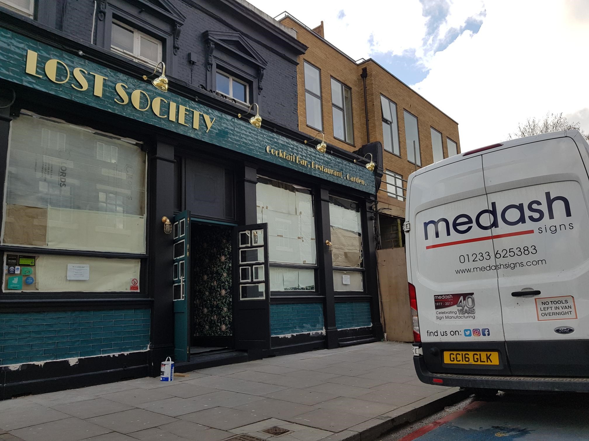
As many companies explore alternatives to more traditional flat signs, we have seen a lot of businesses opting for cut-out 3D letter signs, especially when used in conjunction with backlighting, to create powerful shadow and light imagery. A fantastic example of this is the signage we created for Lost Society: the combination of gold lettering and white lighting created an elegant, effective, and eye-catching sign.
The design specifics for each sign will vary from project to project, but cut-out 3D letter signs have such a wide scope for creativity: they can be built up to create a more physical presence, or flat cut and made out of a wide variety of substrates, including luxury materials such as brass, metal, wood or vinyl.
Built-up 3D letter signs can also be lit from within, making them more visible from a distance and at night. Used in conjunction with bright colours and led lighting, they can’t help but catch the attention of anyone passing by.

Humour in signage
With the opening of so many new eateries, coffee shops and microbreweries, it has become hard to ignore these industries’ penchant for including humour in their business signage and logos.
Once the gimmick for fish and chip shops, puns now rule the day (think ‘the daily grind’, ‘hot shot’, ‘wok this way’, etc…) in both the name of the shop, but also for menu and product names. To counter the risk of looking unprofessional, physical signs should be made to the highest quality and must employ easy-to-read typography: a joke is only successful if it can be read easily and quickly by those walking or driving past.
Humour becoming popular in the food and beverage industry could be a reaction to the unavoidable seriousness of the past few years, or down to the need for independent businesses to stand apart from the larger corporations (which are becoming less trusted by the public: almost two-thirds of people said they trusted smaller businesses over large companies). Humour has been used for years to add a bit of personality to a brand and help it stand out from the crowd: either literally on a high street full of competing signs, or in theory against their competitors.
Vintage/ calligraphy-style signs
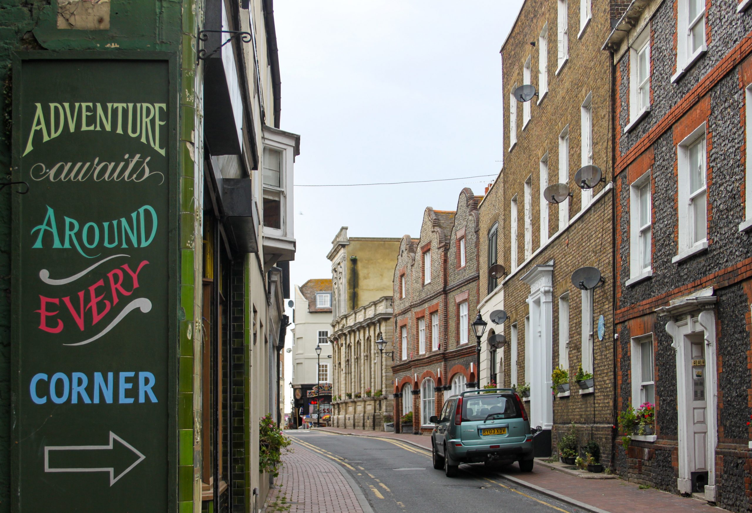
There has been an increase in interest in replicating or reworking vintage hand-painted signs into new designs, especially Victorian or early 20th-century pieces. By using bygone typography – or styles that look as if they were painted by hand – companies are looking to add either a kitsch factor to their aesthetics or to recreate the feeling of longevity that older signs can have, especially in today’s market with so many premises closing – even some that were considered mainstays of the country’s high streets.
Plus with more shops opening up in restored town centres after years of them lying dormant, ‘ghost signs’ – those thought lost to time – are being discovered and restored sympathetically. With a new found love for all things local and historical, new tenants are keen to play on this as well as showcase the heritage of the area. This can be seen to great effect in the old town areas of Margate and Folkestone.
An extra note has to be made for the increasing popularity of signs that appear to be handmade, DIY, or low-key. This is by no means that they are lower in quality. They are still made using the very latest technology and the same high-grade materials as traditional signage, but with the independent nature of smaller businesses that are so in vogue, it’s becoming increasingly popular to design signage to appear as if it has been made by the staff themselves.
This complements the aesthetic and ethos of standing out from larger corporations, and helps infer trust in a brand that wants to appear down-to-earth but professional. Remember: even the most ‘chicken scrawl’ handwriting can be replicated and printed onto high-quality substrates!

The use of window graphics to emphasise branding
Whereas once most of a company’s signage budget would be dedicated to a knockout main sign to hang above the entrance of its premises, there has been a huge rise in the use of window graphics and secondary signage to emphasise branding.
Window graphics not only decorate an otherwise empty space (and may be necessary for privacy reasons) but they can also be useful vectors for creating a consistent branding image: something which more businesses are wising up to, thanks to the world of social media and the constant sharing of visual advertising inspiration.
For many years it has not simply been enough to own and run a business: it must have a coherent visual identity and aesthetic, with a strong ethos and clear messaging. Window graphics can be created to have a more temporary nature, allowing them to be easily changed with the season or for specific occasions, such as a limited edition item or promotion.
Another aspect of this has been the growing demand for teaser graphics, to put up in windows before a business has opened. While historically, any old newspaper or paint was applied to conceal work going on inside the premises, now image-savvy owners know the power of intrigue and how people will talk more about (and anticipate) the new business if they have a hint at what is to come.
Neon signs
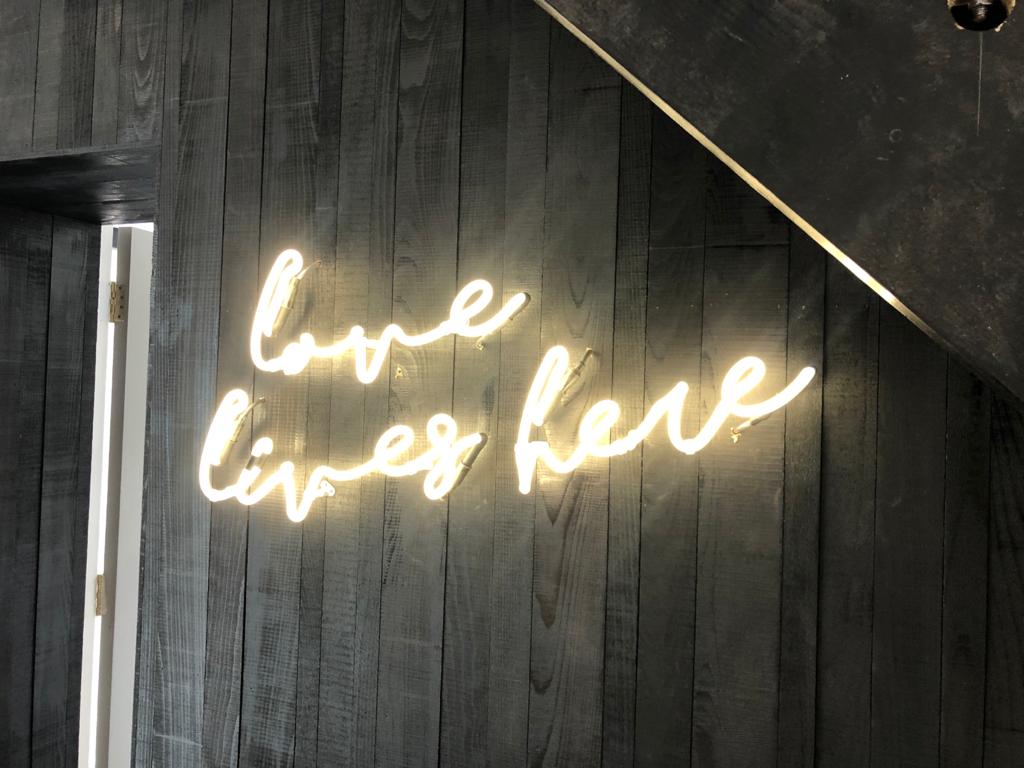
After a period of being considered old hat and a bit naff, neon signs are once again skyrocketing in popularity in 2022. Surprisingly, however, they have made a move to the inside of business premises and are being used as secondary signs or as decoration rather than as a main or fascia sign.
As well as being used to display the company name, neon signs are being utilised more and more with ironic slogans or quotes that are meant to inspire, all to further the brand message of the space and brand. We created just such a sign for Cold Comfort Alpacas (Insert image).
Whether it be for the recent surge in all things nostalgia, or the neon signs’ easily instagrammable qualities, it looks like neon signs are definitely here to stay in 2023 and beyond.
Have we inspired you to begin designing the perfect sign for your business? Let us use our decades of expertise to help you create something both timeless and unique. Our dedicated sign makers work in our 10,000 sq. ft. factory in Ashford, Kent to create signs for each unique specification. Talk to us today to get started.